
When I talk to fellow colleagues about why I use R as my language of choice for scientific data analysis, I typically point out all the advantages, and because I’m honest, the disadvantages.
Typically the biggest disadvantage, especially for those coming from the java-GUI world of Matlab, is the non-interactive graphics. Now, I’ve managed to convince myself that I actually prefer making plots this way (because it forces me to script rather than noodling around with a mouse, the final plot is predictable, etc), but there are always a few things that I wish were easier.
One of those is handling colors in “image” plots and in scatter plots. The former is usually handled pretty easily using the oce function imagep(..., col=oceColorsJet), but the latter tends to be trickier. There is no base R functionality for automatically coloring points by some other attribute. I believe this is relatively easy to do with ggplot2, but that of course requires using ggplot2 (nothing against ggplot2, it just really isn’t an option for me – perhaps the subject of a future blog post).
the colormap() function
With that in mind, Dan and I set out to create a function that could be used to make an explicit “map” between colors and values to facilitate making plots, but also to ensure that the results of the plot are correct. The concept of a “colormap”, as implemented in Matlab, where the information connecting colors to values is inherent in the plot attributes, doesn’t exist in R. One can plot any colors one would like without thinking twice about whether they mean anything. On the one hand, this can be an advantage because it makes it easier to have multiple colormaps in a single figure. The downside is that using colors to represent numerical values requires some care.
The basic idea of colormap() is that it creates an object that connects a series of colors with values, which can be passed to various plotting functions to ensure that the color-mapping is done correctly. Probably the best way to illustrate the various options is through some examples. In most cases the colormap is communicated through the use of a “palette”, which is either drawn implicitly by the plotting function, or through an explicit call to oceDrawPalette().
imagep() plots
The imagep() function is a tweaked and customizable version of the base image() function. It is used for making pseudo-color maps of matrix-style data. A nice example comes from the included argo dataset:
library(oce)
data(argo)

## remove bad data, and grid to regular pressure levels
argo <- argoGrid(handleFlags(argo))

## two-panel plot of T and S, using the cmocean colors
par(mfrow=c(2, 1))
Tcm <- colormap(argo[['temperature']], col=oceColorsTemperature)
imagep(argo[['time']], argo[['pressure']][,1], t(argo[['temperature']]),
       ylab='pressure [dbar]',
       colormap=Tcm, flipy=TRUE, main='Temperature')
Scm <- colormap(argo[['salinity']], col=oceColorsSalinity)
imagep(argo[['time']], argo[['pressure']][,1], t(argo[['salinity']]),
       ylab='pressure [dbar]',
       colormap=Scm, flipy=TRUE, main='Salinity')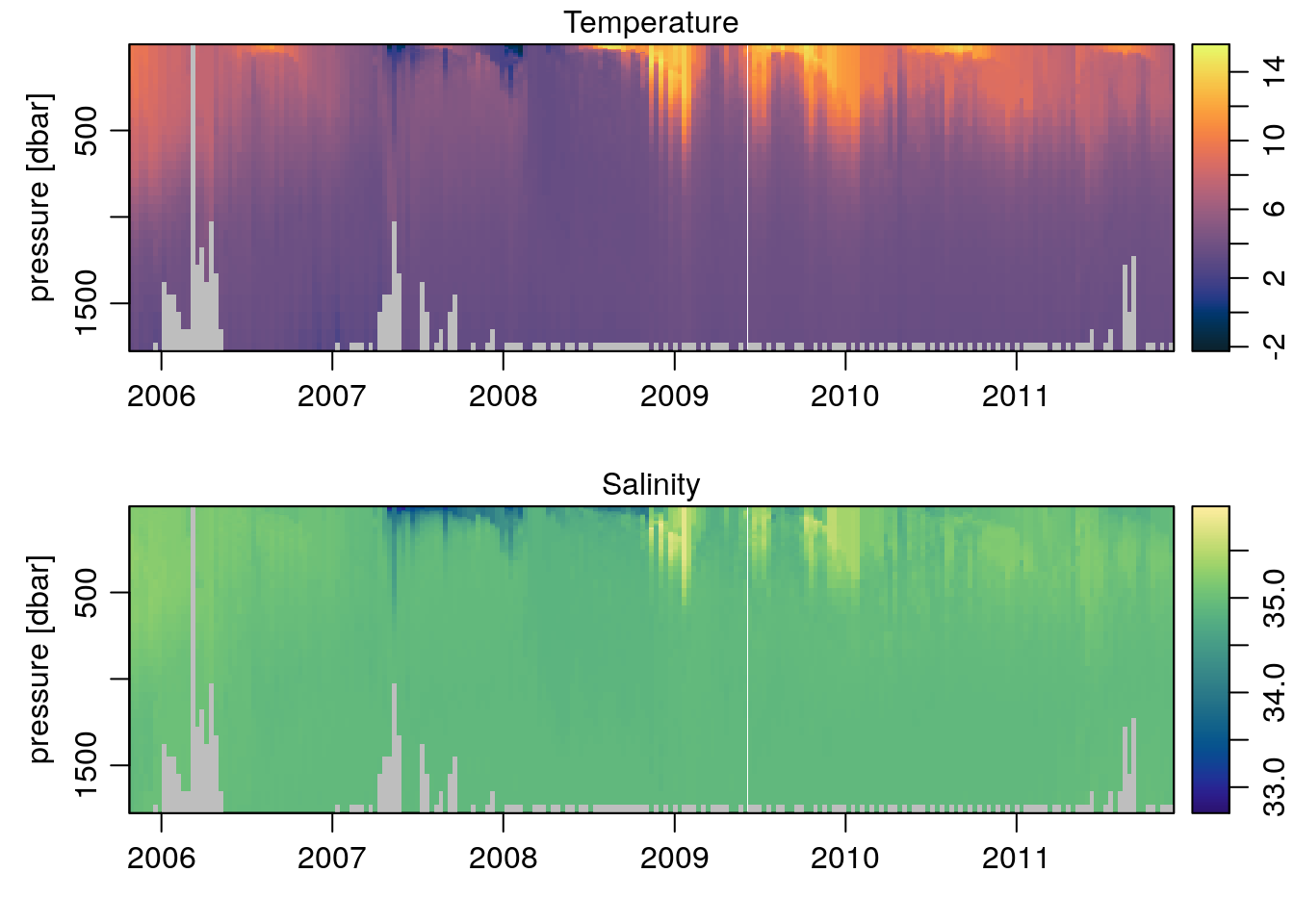
Pretty easy. But using colors with imagep() is pretty easy anyway, since the colormap is defined based on the input data and automatically scaled to match the palette.
What if we wanted to add points showing the temperature values at certain depths to the salinity plot? In Matlab, combining the two colormaps is nigh impossible. Using oce, all we do is reference the Tcm object when we set the colors of the points, specifically the $zcol element within it – which contains a colormapped color for every element in the original data used to create Tcm:
## random points to plot
set.seed(123)
II <- sample(seq_along(argo[['temperature']]), 100)
t <- matrix(rep(argo[['time']], dim(argo[['pressure']])[1]),
            nrow=dim(argo[['pressure']])[1], byrow=TRUE)[II]
p <- argo[['pressure']][II]
T <- argo[['temperature']][II]

par(mfrow=c(2, 1))
Tcm <- colormap(argo[['temperature']], col=oceColorsTemperature)
imagep(argo[['time']], argo[['pressure']][,1], t(argo[['temperature']]),
       ylab='pressure [dbar]',
       colormap=Tcm, flipy=TRUE, main='Temperature')
points(t, p, pch=22, bg=Tcm$zcol[II], cex=0.75)
Scm <- colormap(argo[['salinity']], col=oceColorsSalinity)
imagep(argo[['time']], argo[['pressure']][,1], t(argo[['salinity']]),
       ylab='pressure [dbar]',
       colormap=Scm, flipy=TRUE, main='Salinity with discrete temperature measurements')

## Add the temperature colormapped points overtop
points(t, p, pch=22, bg=Tcm$zcol[II], cex=0.75)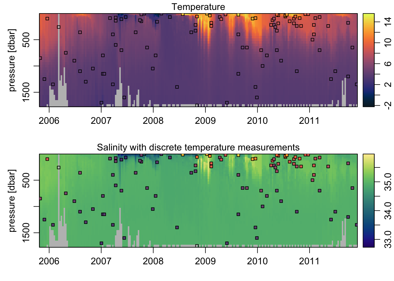
Plotting a colored scatterplot, with a palette
The example above introduced how to use the $zcol return value of the colormap object to color the plotted points according to the desired colormap. Here I’ll explore that a bit further, highlighting how to use it with a basic plot, but with a palette on the side.
x <- seq(0, 6*pi, 0.1)
y <- sin(x)

## create a colormap for cos(x)
cm <- colormap(cos(x), col=oceColorsPalette)

drawPalette(colormap=cm, zlab=expression(cos(x)))
plot(x, y, col=cm$zcol, pch=19)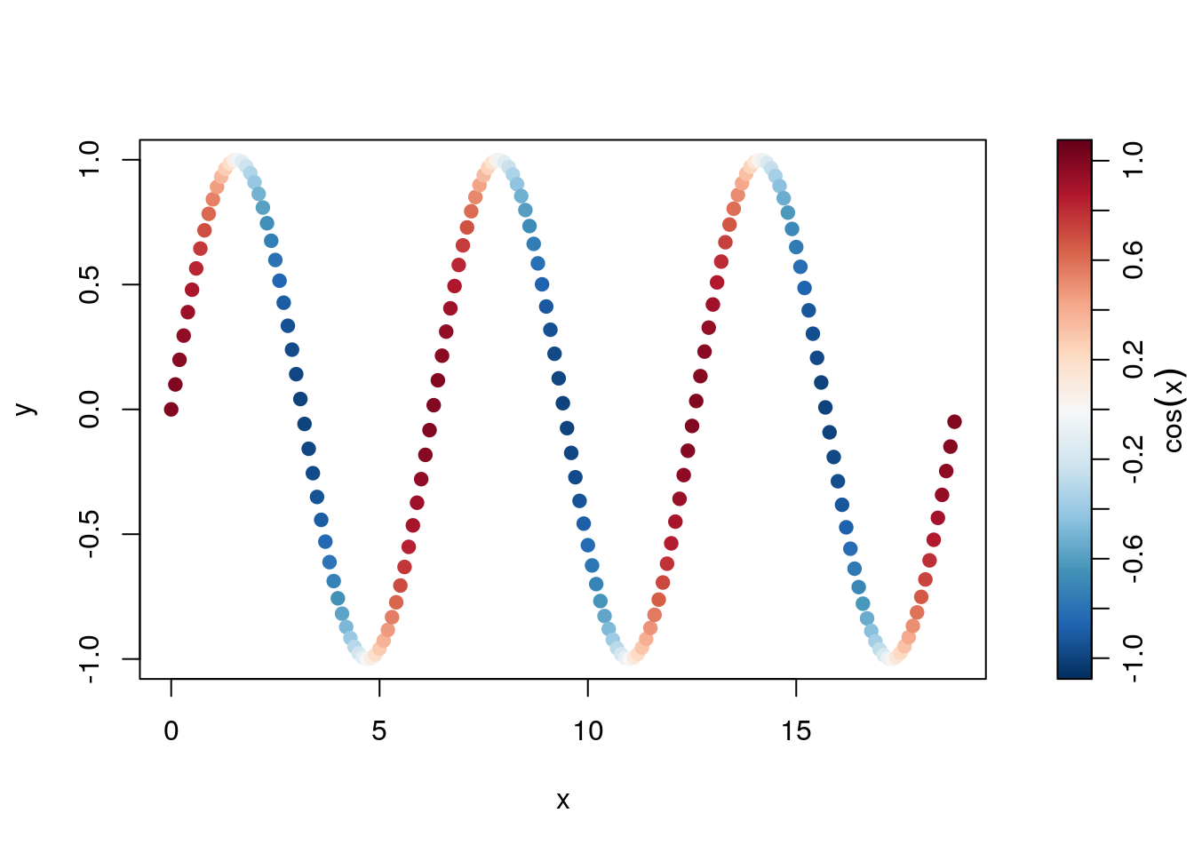
Using named GMT-style palettes
In creating colormap(), Dan and I were impressed with the color palettes available in the Generic Mapping Tools (GMT) software, and decided to implement a similar approach to defining custom colormaps. In addition, colormap() includes a number of “named” GMT palettes (see ?colormap), several of which are quite handy for plotting topography.
par(mar=c(0.5, 0.5, 0.5, 0.5))
data(topoWorld)
data(coastlineWorld)

## Use the gmt_relief palette
cm <- colormap(name='gmt_relief')

drawPalette(colormap=cm)
mapPlot(coastlineWorld)
mapImage(topoWorld, colormap=cm)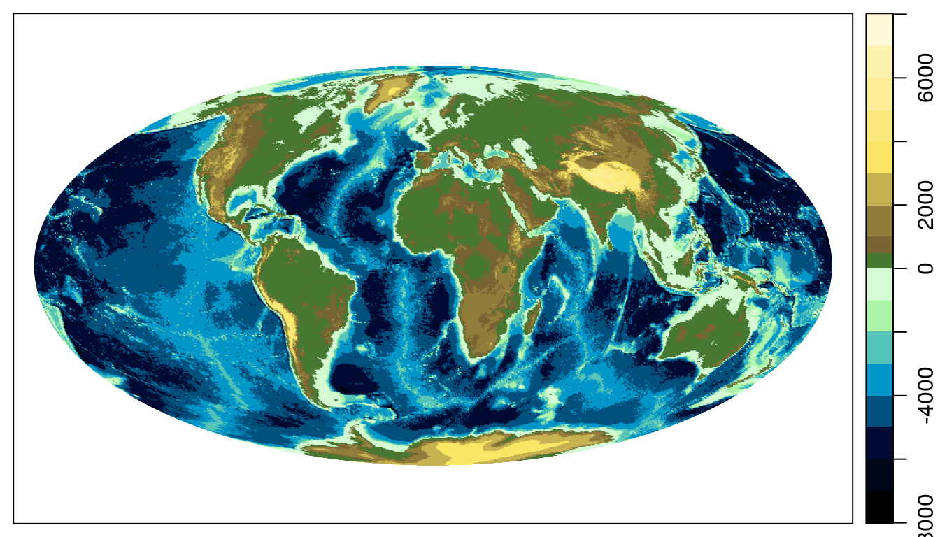
Conclusion
The colormap() function is pretty powerful, and as a result somewhat complex to use. I hope the above examples have helped shed some light on how to use oce to map colors to values consistently and reliably in plots.